You are using an out of date browser. It may not display this or other websites correctly.
You should upgrade or use an alternative browser.
You should upgrade or use an alternative browser.
Official Testing Thread
- Thread starter Lowthor
- Start date
Katsujirou
The Street Samurai
Animating the smoke.
That should be do'able. I added the smoke by hand (difference clouds, smudge, adjusted contrast, some cross hatching) ... perhaps fading between multiple layers would work ... I'll see!
Thanks Jayliss!
That should be do'able. I added the smoke by hand (difference clouds, smudge, adjusted contrast, some cross hatching) ... perhaps fading between multiple layers would work ... I'll see!
Thanks Jayliss!
Just some Sin City Idea, but you could also make the entire thing black and white in transition and make the eyes the only thing in color other than the name, and possibly the cherry on the cigarette. If you have coral Painter I would say do it with a tight brush setting and oil based effect for the paint.
U
UnHoly Charm
Guest
Animating the smoke.
That should be do'able. I added the smoke by hand (difference clouds, smudge, adjusted contrast, some cross hatching) ... perhaps fading between multiple layers would work ... I'll see!
Thanks Jayliss!
Your welcome
(is Jayliss)
Very nice. I like.
Katsujirou
The Street Samurai
I'd give the "Child of The Night" a black outer glow, 1 pixel wide, 100% opacity.
It'll help to seperate it from the black mist you've got around it. Otherwise it sort of blends in a bit and is a tad difficult to read.
I like the lighting, though. Well composed.
It'll help to seperate it from the black mist you've got around it. Otherwise it sort of blends in a bit and is a tad difficult to read.
I like the lighting, though. Well composed.

Katsujirou
The Street Samurai
Yes, better.
Katsujirou
The Street Samurai
Alright, I decided to scrap the animation idea and stick with what I feel most comfortable doing: simple layering with mixed effects and some homemade brushes.
Voila!
Voila!
Katsujirou
The Street Samurai
Hell man, don't let me ruin your swagger.
Slap your Samurai avatar up for us all to "Ooohhh" and "Ahhh" at. I want to see it.
Slap your Samurai avatar up for us all to "Ooohhh" and "Ahhh" at. I want to see it.
Ceros
Tech-*****
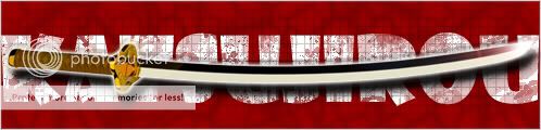
If you're still looking for advice, I would say that in your present sig, the sword is placed right over the text, making it difficult to read. I'd try dropping it down if I were you.
Also if the samurai sword was a well made one, the curve of the blade would flow into the handle, instead of being added at an angle.
http://en.wikipedia.org/wiki/Katana <-- Check the first image on the page, how the bottom part follows through. In your picture, it looks as though the sword handle doesn't curve. Don't know if you care, but thought you would be interested.
Katsujirou
The Street Samurai
It's meant to look a little cartoonish, but thanks for the pointer.
Regarding the placement of the sword, I was trying to make a point. Can you figure it out?
Regarding the placement of the sword, I was trying to make a point. Can you figure it out?
We are supposed to stab you ? Or the core of who you are is a warrior......I prefer the first option *Gets out Fei Lian (Pole Arm) and jabs it at Katsujirou's ribs*
Tifferzzz
Resident Badass
Kat,
First of all *points at SJ* Ignore him, he hates everyone and everything anyway. Expect him to always be displeased with you, and that way when he likes you, then you know you've done something right.
Secondly, I liked the first signature better. The second one just looks thrown together. The first one looks more character-originated, and I know there are a lot of people who can either help you to make it better, or that can design one for you.


Siorai
Mystical Soul Incarnate
lol Rhy, it would be too big anyways. The sig can't be bigger then 550x150 at least that's what it told me when I placed it into my profile...
Oh and I am not sure if I'll use that one anyways, looking for better pics. Perhaps more fantasy like but not sure quite yet...
Oh and I am not sure if I'll use that one anyways, looking for better pics. Perhaps more fantasy like but not sure quite yet...